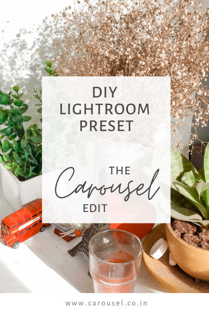
A lockdown, some pending tasks & a Lightroom tutorial!
Hey you!
We are so glad you're here :) A very warm welcome to our sacred space!
Adding a blog to our website was one of the longest pending tasks in our never-ending to-do-list and we are so happy, it is finally here! Sure, we love our Instagram, but blogs are so very special. We think of them as our long term relationship, with you. This is the space we will truly be ourselves. Share all our deep secrets, some life-saving hacks (tried and tested!) and a lot of DIY's! We will leave the getting to know each other for another post but since this our first ever post, we want to make it about YOU! For you, rather.
If you follow us on Instagram, you know we're suckers for aesthetics! Which is why all of our photography and editing happens in-house. (Read: No budgets for outsourcing!) As taxing it is, we also enjoy the process because it teaches us a lot of tips and tricks on the go!
Thanks to the lockdown,(not really!) we managed to put together a super quick LIGHTROOM tutorial for you! If you're the kind who spends hours looking at drool-worthy presets bloggers use, then this tutorial is meant for you. We have made it as easy as we could and have a FREE CHEAT SHEET at the end of our very own preset for you to do it yourself !!
First things first, download the ADOBE LIGHTROOM APP on your mobile!

Let's begin, shall we?
1) KNOW YOUR STYLE!
You have shot the photo of your dream! Now make it yours by editing it to the style you feel that suits you the most. Do you love the bright and airy ones? Or do you belong to the dark and moody side?! How about some pastel aesthetics?! Since we have a product-based page we use Lightroom to enhance the lighting and colours but if you're using it for yourself or a blog, explore as much as you can :)
2) LET'S GET DOWN TO THE BASICS!
You will be amazed to see the difference in your editing if you understand the basics and edit your pictures accordingly! When you open your Lightroom App, you will see a lot of tabs. But do not be overwhelmed! Let's take this step by step! :) Here are a few terms you need to understand before editing images.
LIGHT TAB
EXPOSURE: We adjust the exposure to control the overall amount of light that we want in our images.
CONTRAST: Adjusting the contrast of a picture is similar to adjusting the brightness, except you’re decreasing or increasing the darker tones of the image and increasing or decreasing its strength.
HIGHLIGHTS: The highlight determines the bright values (of all the colours) in your images.
SHADOWS: The shadow determines the dark values (of all the colours) in your images.
WHITES: The whites are used to enhance or lower the absolute whites in your images.
BLACKS: The whites are used to enhance or lower the absolute blacks in your images.
COLOUR TAB:
TEMP: This is what decides the overall tone/mood of your photo. If it will be towards the cool blue tones or warm and fuzzy one? (just like us!)
TINT: A tint adds a film of tonal colour to your image. For eg, if you want a peachy looking image, then you will slide to towards the orange side.
VIBRANCE: The vibrance boosts colour saturation without affecting the skin tones. Wish your top was a little more yellow? Think vibrance, dear friend!
SATURATION: Saturation is the strength behind every colour. Adjusting the saturation increases the amount of black and white mixed with your colour! Wish your top was a little more DEEPER yellow? Think saturation, dear friend!
COLOUR MIX TAB (FOR INDIVIDUAL COLOURS) :
HUE: Hue is just another way to say colour. The Hue slider in Lightroom modifies the colours found in your image. It replaces them with the adjoining colours you find on the slider. For eg, if our jeans are a darker blue and we want to make it a tint of teal, we will adjust the hue of the colour.
SATURATION: As mentioned earlier, saturation is the strength behind every colour. You can change the strength of any colour by using the Saturation slider. This is where you make the colour more or less prominent in your scene. For eg, if our top is a faded red and we want to make it deeper, we will adjust the saturation of the colour.
LUMINANCE: Luminance indicates how vivid the colour is. Same as saturation, increasing the slider value makes it stand out more. Decreasing the slider value makes the colour that you’re working with darker. For eg, if the green of your plants is not visible then we adjust the luminance of the colour.
3) YOU'RE SET TO EDIT!
For your practice, we have made a cheat sheet for you to follow. Follow the values and edit accordingly! It would make us the happiest to see you'll use them! Tag and let us know @carousel.india or comment below and let us know how you like them :)
Until then Stay Home and Stay Safe!

You can also save the preset with a fancy name or save it as your name if you're anything like us! You can save it by clicking the three dots on the right side of the app. Here, we have a reference for you.
